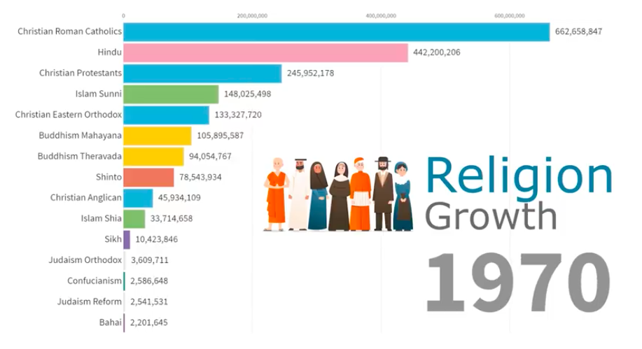
Data is Beautiful, a YouTube channel that creates visualizations of trends, created this enlightening animation to show the world’s largest religions in terms of population, from years 1945 through 2019.
At 150 seconds, it may confirm some of your own observations, if you’ve traveled around the United States much over the past 60 years, and particularly in the last 40 years, where the most change has occurred.
Or you might be surprised. This is a “must see” video, and a tip of the hat to a sharp-eyed Must Read Alaska contributor in Juneau.

Excellent find. Thank you Suzanne.
Holy cow, no pun intended. We will all be under sharia law soon.
Wow! Seems authentic, but how can we be sure?
Has most to do with birth rates of Muslim countries. As they become affluent, educated, higher standard of living the pattern will slow.
Comments are closed.