MORE FUN WITH STATISTICAL MANIPULATION
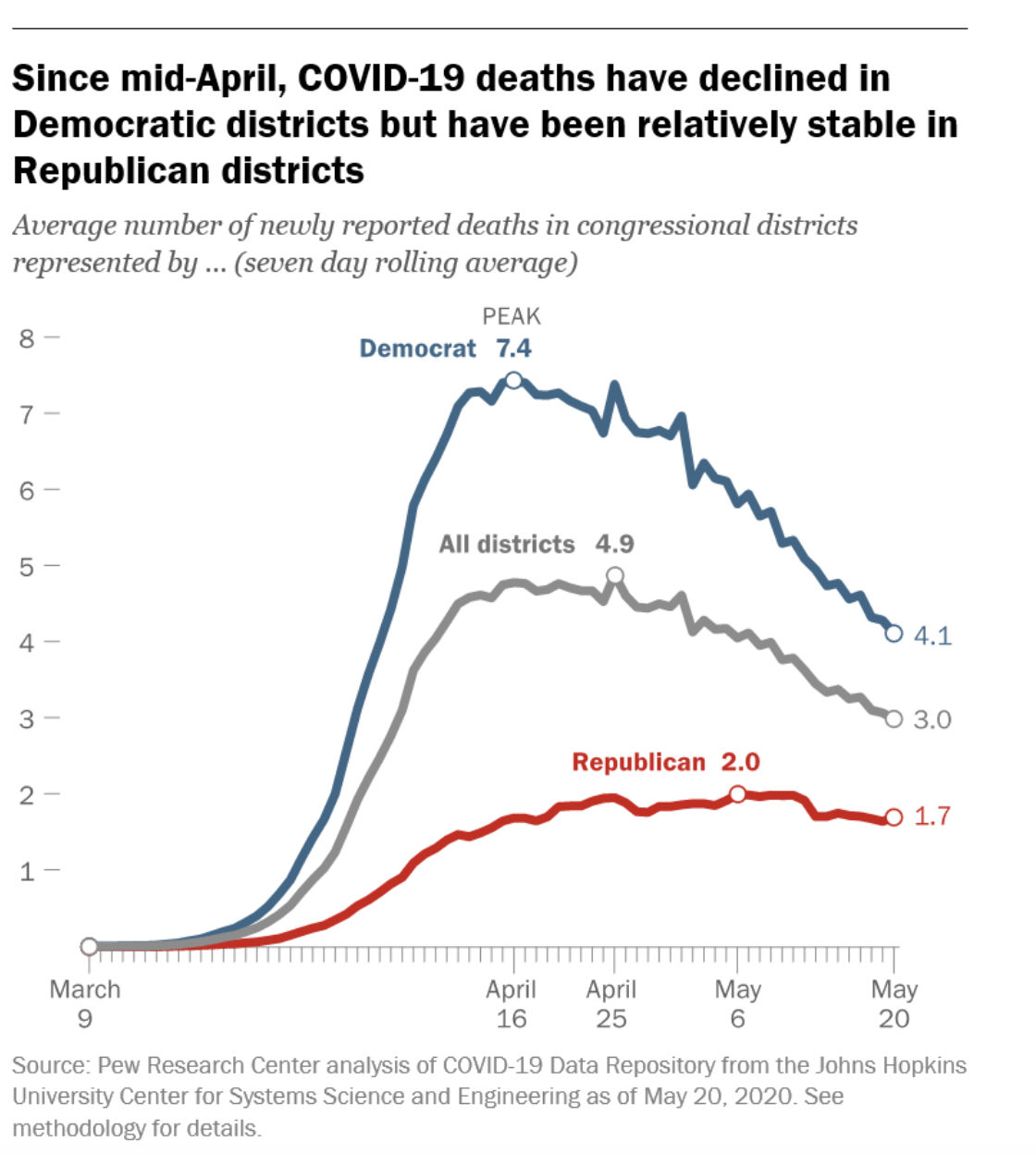
Pew Research went to Twitter with one of its latest explainer charts, showing that, according to the headline, Republican states are just not reducing their COVID deaths as fast as Democrat-controlled states.
The chart, as it turns out, is one of several in a Pew story about how Democrat states are experiencing the most COVID-19 cases and deaths — but that’s not what their headline says on the graph the group featured on Twitter.
Without the context of the story, viewers might not pause long enough to see that the reasons that the deaths are not dropping as fast in Republican-controlled states is because those states have not had as serious a problem with the coronavirus as their Democrat counterparts.
Here’s how MRAK’s resident statistician explained how Pew came up with its conclusion — by ignoring the early data when the cases were rising in Democrat-controlled states and only focusing on deaths since April 25:
Hard to reduce what you barely have.
Pew Research…should ring a bell. Aren’t these the people who were central to advocating all the decriminalization moves that had to be reversed last session?
Simple fact is most Democratic Districts are in jumbled up urban areas where hundreds of people ride the same elevator home every night and thousands more pack themselves into Public Transportation. . Wait, could it be that Public Transportation helped spread this pandemic? In Republican Districts the only people you see on the Bus are those who have lost their driving privilege due to an alcohol related event. Could Public Transportation be an incubator for Covid-19? Hmm…I wonder.
Love this graphic! Reminds me of the “hockey stick” graphs on climate change.
Time will tell as long as no one cooks the data. From what I can tell, this virus is indiscriminate, and one’s ideology is little protection from its charms.
I can’t believe people are still falling for this covid crap. It’s so obvious that this was a political hit job on an international scale. The CCP and it’s handlers throwing a tantrum because so many people are awakening…can’t have that!!
Amazing how the continual twist and turn is presented in an attempt to justify the idiotic reaction to a virus and attempt to perpetuate the need for “control”.
This is absolutely Orwellian. The shark has been jumped.
As long as we’re parsing data to win “gotcha” points, let’s look even closer at the chart. What’s this? *shock*!!! *horror*!!!
From April 29th to May 2nd the democrat states showed a dramatic INCREASE in COVID cases, whereas the republican states showed no change.
And that’s not bad enough, it happened AGAIN May 3rd through 5th. Will democrat states never learn?! How can they keep repeating these foolish behaviors!
The resident statistician has it right … Nothing To See Here.
Remember the old statement “Liars figure and figures lie”
Comments are closed.